My postcard from Martina Flor's Skillshare class "The Golden Secrets of Hand-Lettering: Create the Perfect Postcard." The class offers a good foundation in understanding how letters are built, followed by Martina's drawing and vectorizing process.
It certainly helped me in my process, detailed below. I went from historic lettering inspiration in my thumbnails, then brought in elements of nature – the endangered ghost orchid native to South Florida – in my sketches. For the full story, check it out in the Project Gallery for the class!
I love travel writing, and the exploration of different cultures in this book inspired some classical lettering juxtaposed with whimsical surface design.
A fun lettering project decorating the Italian names for the four seasons.
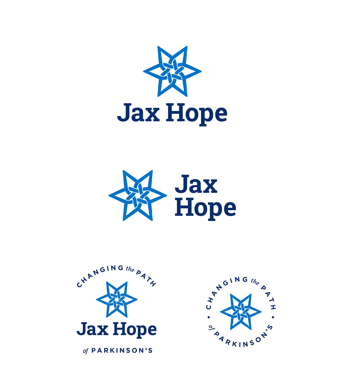
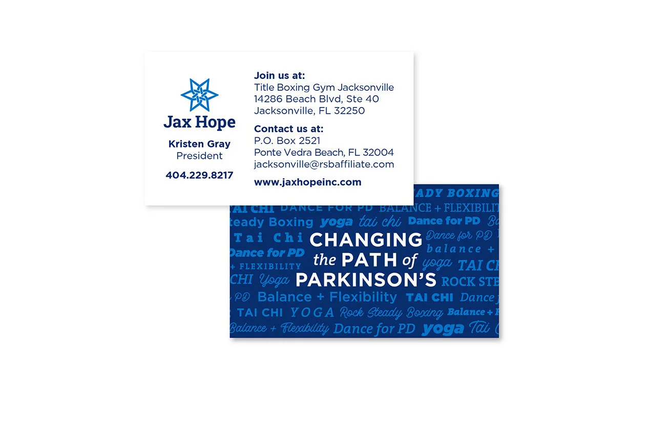
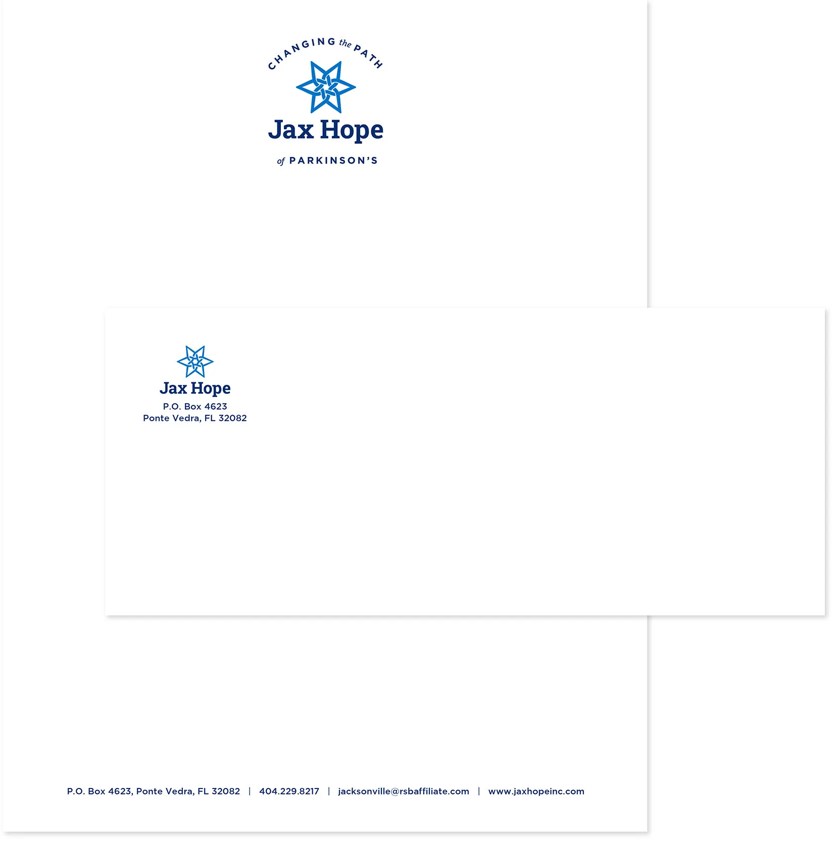
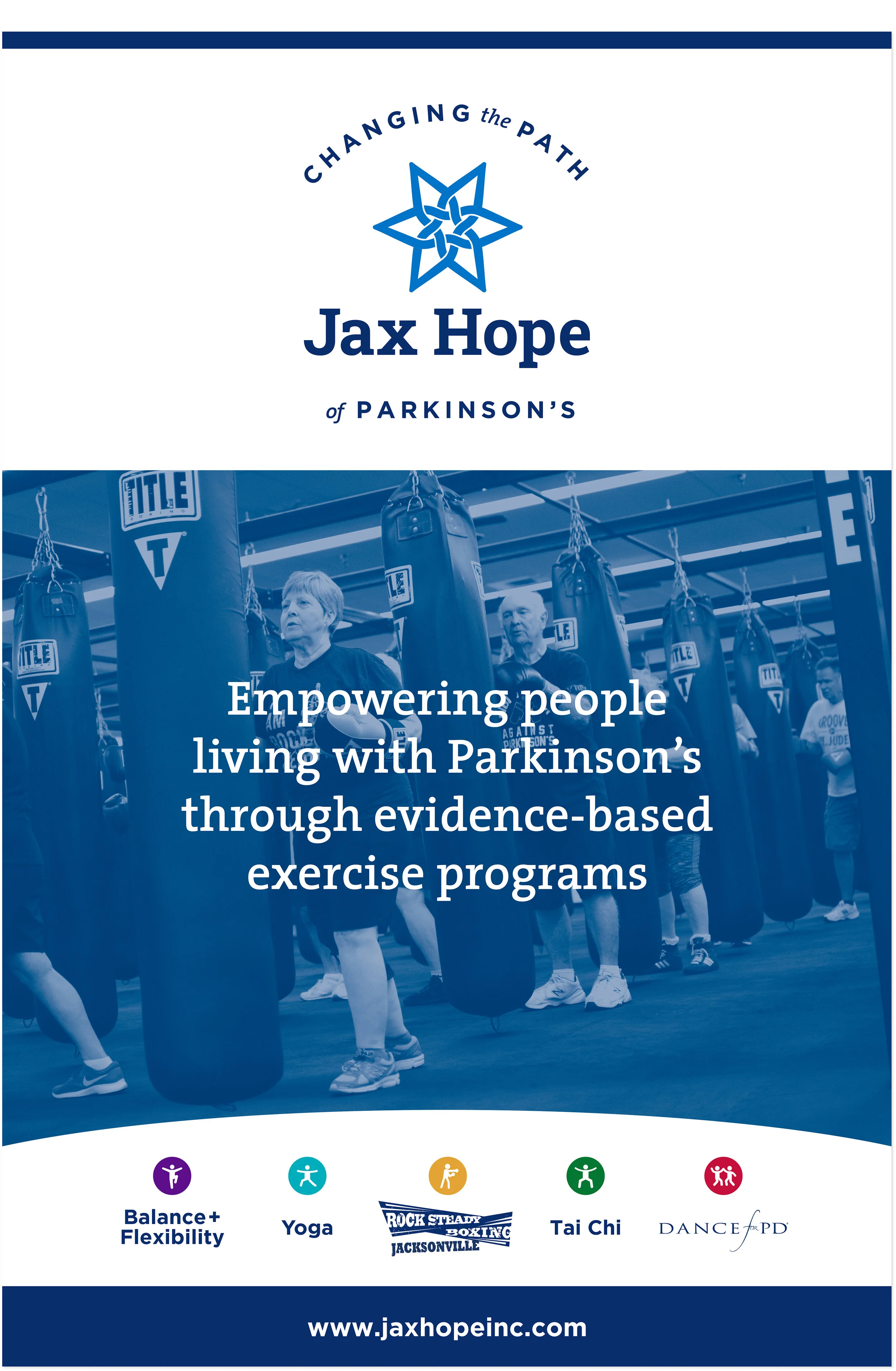
Jax Hope is a local non-profit that works to empower people living with Parkinson’s Disease through exercise and wellness programs. The cornerstone program is an affiliate of the national Rock Steady Boxing for Parkinson’s organization. Other programs include Yoga, Dance for PD and Tai Chi.
The blue icon symbolizes the types of exercises beneficial for people living with PD. The rays emanating from the center represent the concept of reaching outward, making big movements, keeping a wide stance to maintain balance, taking big steps, and projecting the voice. The elements link to each other around the center, indicating the teamwork and support central to the exercise programs that Jax Hope offers. Typography is solid yet friendly, conveying the family spirit and fun social atmosphere the members love about the organization.
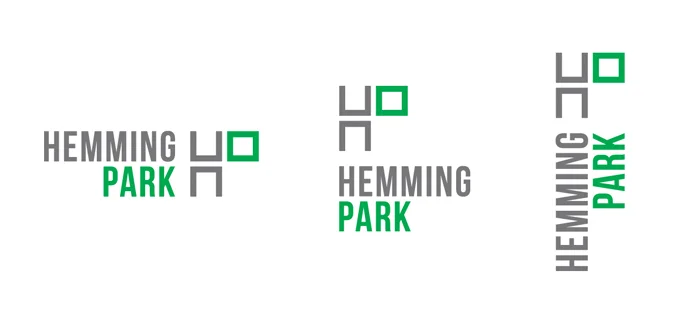
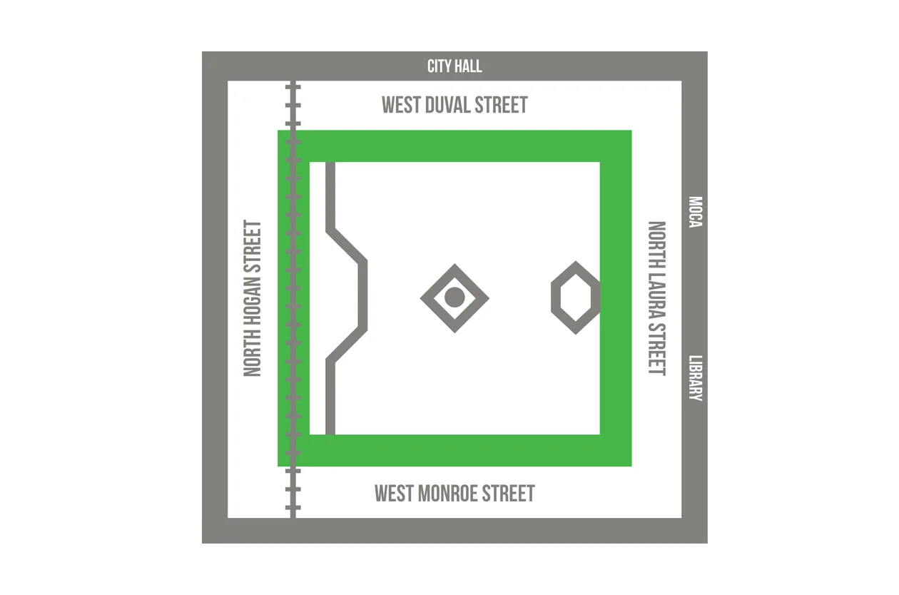
Concept and icon for Hemming Park. Toward the end of my year-long internship at Brunet-García Advertising in Jacksonville, Florida, I was fortunate to work with the art directors and agency principal on this identity for the revitalization of an historic downtown park.
The logo references the grid of a street map and the green space the park will become once the renovation is complete. Sadly, my internship ended before the identity was fully developed, and I only had the opportunity to create a few more elements in addition to the icon.
The logo won a 2015 Silver ADDY, Jacksonville chapter, for Elements of Advertising, Logo.
Designed at Brunet-García Advertising. Lockups and art direction by Kedgar Volta. Additional art direction by Aerien Mull.
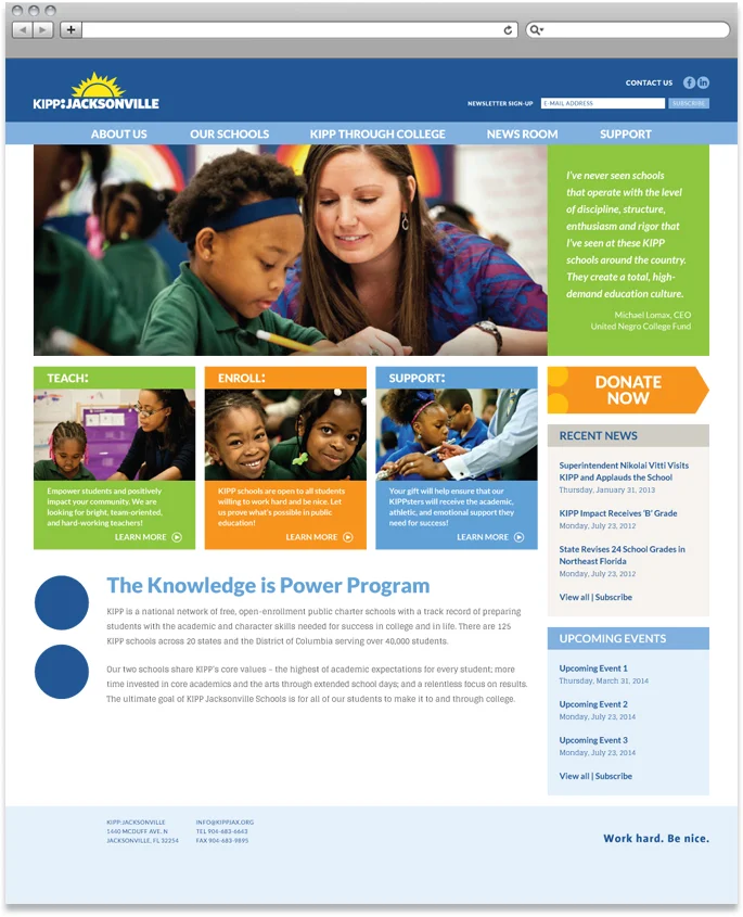
Design for KIPP Jacksonville's Web site, www.kippjax.org. KIPP, the Knowledge is Power Program, is a national network of public charter schools dedicated to preparing students for college right from the start of their education. The new site applies KIPP's brand standards more closely than the old site and allows for better content organization.
Designed at Brunet-García Advertising with art direction by Aerien Mull.
The Cathedral Arts Project works to provide an arts education to students in Jacksonville, Florida, who may not otherwise have the opportunity to develop their creative talent. This brochure uses the energy and creativity of the organization's students to outline its four-part strategy for growth in the coming years.
Designed at Brunet-García Advertising with art direction by Aerien Mull.
Magazine insert, menu design, and patterns for The Cultural Council of Greater Jacksonville's awards event honoring leaders in the local arts community.
Designed at Brunet-García Advertising with art direction by Kedgar Volta.
Trifold brochure and various flyers for One Call Care Management. One Call is a leading provider of worker's compensation claims management.
These pieces use One Call’s color coding system to designate products, services and contact information for the business units within the company. Generous white space, clear typography, and a friendly blue and gray palette convey an air of caring and efficiency in an industry that can be challenging to navigate for both patients and providers.
Designed at Brunet-García Advertising with art direction by Aerien Mull.
Cover and interior design and production, as well as cover photography, for this annual publication of The Beaches Leader. Beaches Health Resource features directories of local medical offices, health-related organizations and community resources.
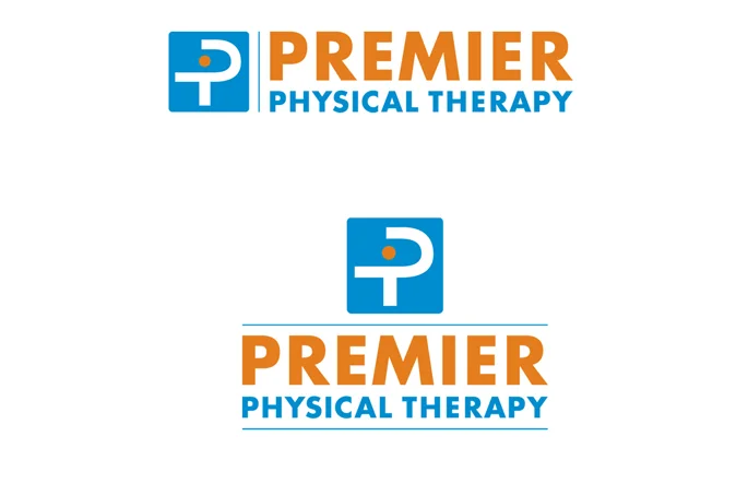
Premier Physical Therapy is an independent outpatient clinic in Jacksonville that came into new ownership. The new therapist-owners wanted to keep the existing logo and brand identity initially, so a series of brochures was designed using the established branding style.
Once the transition of ownership was complete, a new, bolder identity system was designed and applied to the same brochures, as well as business cards, letterhead and office forms. Futura was kept as the signature typeface, and the same basic identity colors were used. However, the new brochures feature a more vivid color palette and full color photographs, rather than the duotone artwork of the old system.